Designing for Clarity: How User Interface and Icon Sets Elevate Digital Projects
At its core, User Interface (UI) is the bridge between users and digital experiences. Whether you're navigating a mobile app, browsing a website, or interacting with a dashboard, the UI shapes how smoothly and enjoyably you can accomplish your goals. Icons play a crucial role in this interaction—they simplify complex ideas, guide users intuitively, and add visual rhythm to interfaces.
Why Icon Design Matters in User Interface
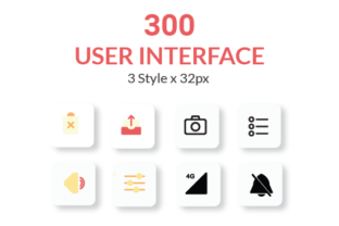
Icons are more than decorative elements. In UI design, they act as visual shortcuts that help users understand functionality at a glance. A well-designed icon can replace a paragraph of text and still communicate the same message. That’s why having a library of 225 icons in three distinct styles—Line, Solid, and Flat—gives designers the flexibility to match the tone and purpose of any project.
Real-World Uses of a Versatile Icon Set
Consider a mobile banking app aiming to feel secure and modern. A Solid icon style might be used for action buttons like “Send Money” or “Deposit Check,” offering clarity and confidence. Meanwhile, a lifestyle app focused on wellness or travel might lean into the Line style for a lighter, more approachable feel. The Flat style bridges both, offering a minimalist aesthetic that works across industries.
Industries That Benefit from Thoughtful Icon Design
- E-commerce: Clear icons for cart, wishlist, and filters make navigation intuitive, especially on mobile where screen space is limited.
- Healthcare: In medical apps or dashboards, icons help convey critical information quickly—like heart rate, alerts, or medication reminders.
- Education: Learning platforms use icons to represent courses, progress, and assessments, helping users focus on content rather than navigation.
- Travel and Hospitality: From flight status to hotel amenities, icons reduce language barriers and streamline user journeys.
Consistency and Precision in UI Design
Pixel-perfect consistency is non-negotiable in UI design. When icons don’t align with the grid or vary in stroke width, it creates a subtle but noticeable visual friction. A professionally curated icon set ensures uniformity in size, spacing, and detail, making the overall interface feel polished and intentional.
This level of attention is especially important when designing for multiple screen sizes. An icon that looks sharp on a desktop might become illegible on a mobile screen if not properly optimized. That’s why having icons available in scalable formats like SVG, PNG, and EPS ensures adaptability across web, app, and print media.
Customization for Every Design Need
Every project has unique visual needs, and a one-size-fits-all approach rarely works in UI design. The ability to customize color, size, and stroke width means these icons can blend seamlessly into any design system. Whether you're working within a dark mode interface or a vibrant brand palette, these icons can be tweaked to match without losing clarity.
Designers using Adobe XD, Sketch, or Figma will appreciate the included project files, which make it easy to drop icons directly into layouts. Plus, having the Adobe Illustrator source file allows for deeper customization—ideal for teams that want to tweak icons or create new ones that match the existing style.
Who Uses These Icons—and How
UI designers aren’t the only ones who benefit from a high-quality icon set. Here’s how different roles and industries put them to use:
- Freelance Designers: Speed up client projects with ready-to-use icons that maintain a cohesive look and feel.
- Startup Teams: Build polished MVPs without spending time sourcing or designing icons from scratch.
- Marketing Teams: Use icons in infographics, presentations, and landing pages to enhance visual storytelling.
- Developers: Easily integrate icons into front-end code with SVG support and consistent naming conventions.
When to Choose Line, Solid, or Flat Icons
The choice between Line, Solid, and Flat styles depends on context, audience, and tone:
- Line Icons: Best for lightweight interfaces, dashboards, and apps where minimalism is key. These icons convey elegance and simplicity without overwhelming the layout.
- Solid Icons: Ideal for touch targets and action buttons where visibility and impact matter most. These icons stand out clearly, even at smaller sizes.
- Flat Icons: A versatile choice that works well in both web and app environments. Flat icons offer a modern, clean aesthetic that pairs easily with most UI kits.
Practical Considerations Before Choosing Icons
Before selecting icons for your next UI project, consider the following factors to ensure they enhance rather than hinder the user experience:
- Context: Will the icon be used in a navigation bar, a tooltip, or a data visualization? Context determines the level of detail needed.
- Accessibility: Ensure icons are paired with text or have sufficient contrast to be understood by users with visual impairments.
- Scalability: Vector formats like SVG maintain quality at any size, making them ideal for responsive designs.
- Brand Alignment: Icons should reflect the personality of the brand—whether that’s playful, professional, or tech-forward.
Strengths and Limitations of Pre-Made Icon Sets
One of the biggest advantages of using a comprehensive icon set is efficiency. It saves time and ensures visual consistency, especially for teams working under tight deadlines. However, there are limitations to be aware of:
- Generic Meanings: Some icons may not perfectly align with niche functions, requiring customization or additional explanation.
- Overuse: Relying too heavily on icons without supporting text can confuse users unfamiliar with certain symbols.
- Licensing: Always verify that the icon set is licensed for both personal and commercial use, especially if you're building products for clients or sale.
Putting Icons to Work Across Platforms
From app development to print materials, these icons are designed to work across a wide range of use cases. For instance, a UX designer might use them in a Figma prototype, while a marketing team repurposes the same icons for a presentation deck or social media graphic. The inclusion of multiple file formats (SVG, PNG, EPS) ensures they can be used in nearly any context without quality loss.
Print designers will appreciate the high-resolution EPS files for brochures, posters, or reports. Web developers benefit from SVGs that scale perfectly on retina displays. And mobile designers get peace of mind knowing that the icons are built with standard grid systems and spacing guidelines that align with Apple and Android design standards.
Final Thoughts on Icon Design and User Interface
In the world of digital design, small details often have the biggest impact. A well-placed icon can guide a user through a complex process, reduce cognitive load, and even evoke emotion. Whether you're designing a productivity app, a corporate dashboard, or a personal blog, having access to a thoughtfully crafted icon set makes a real difference in both efficiency and outcome.